Author Archives: Cameron

Making Paper Patterns

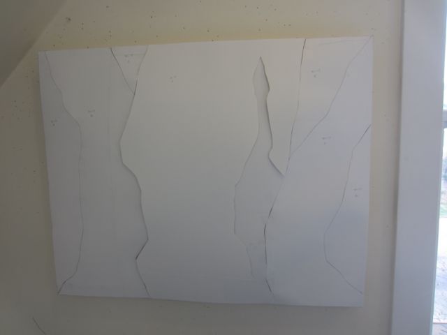
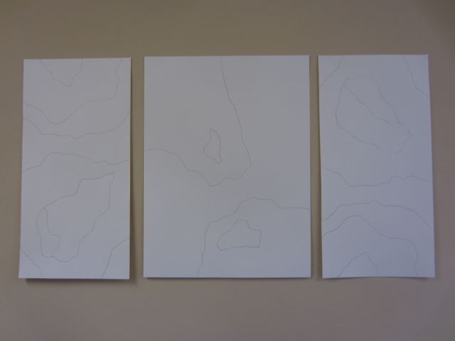
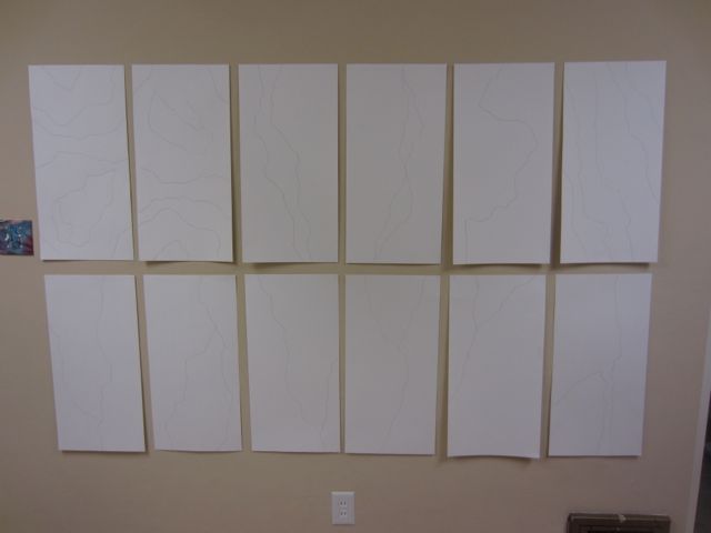
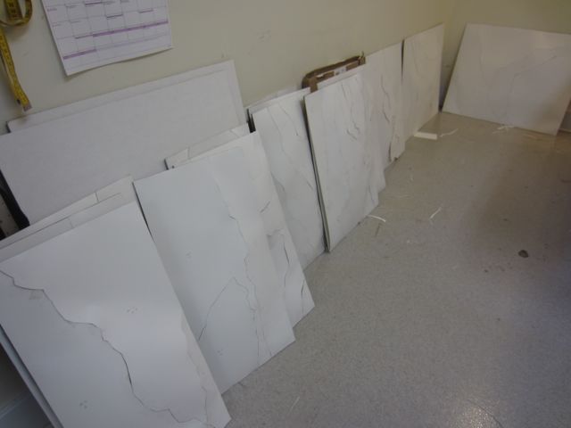
I’ve just finished roughing out paper patterns for 18 new wall mounted works for my March show at Foster/White. It’s hard to show what I’m doing in this phase because it’s just white on white. It’s a little crazy-making working on these day after day but I am definitely feeling a sense of satisfaction in seeing them pile up around the studio.

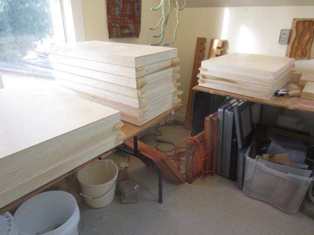
Mia, my intern, has started prepping the wood panels for them to be mounted on. She sealed them yesterday and will start painting the edges tomorrow.

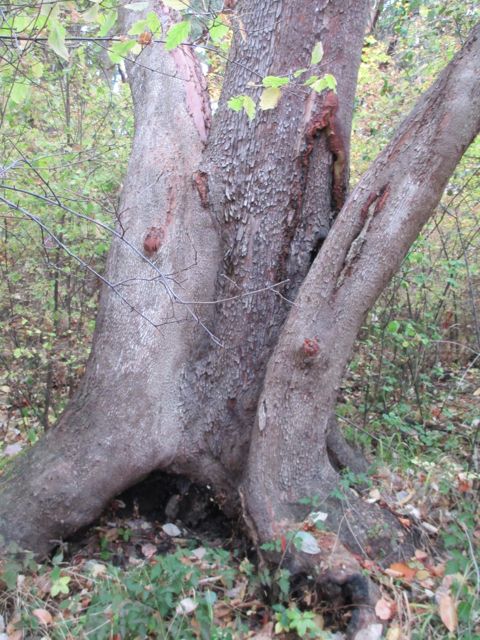
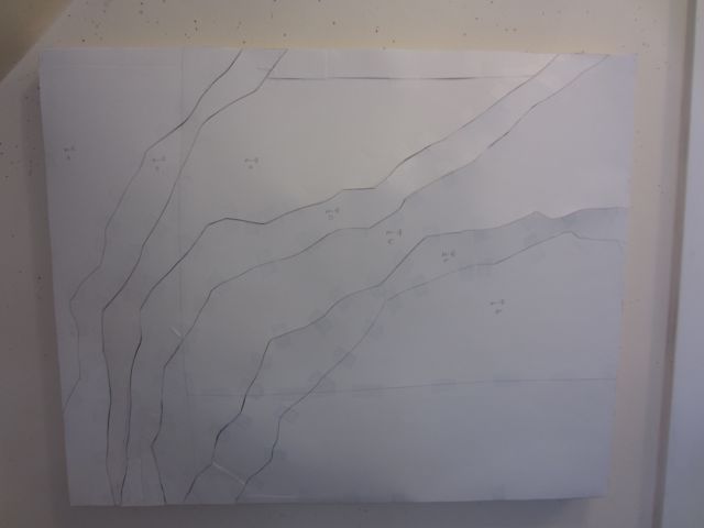
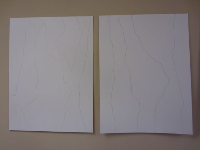
For this series I’m working more directly from photographs than I have before. The following are the patterns for Madrone 17 and 18 and the photos that inspired them.

Madrone 17

Madrone 18

I’m approaching the work in a different order, too. Usually I pick a color palette and do a bunch of dyeing before I design the patterns. Then, once I have the patterns done, I play mix and match with the fabrics. This time I made the patterns first. It should streamline the process and save me some time.

The problem is I’m kind of sick of white on white and little bits of paper. I haven’t decided whether to keep at it and refine the patterns while I’m in the groove or to take a week off from patterns and play with color.

It may depend on the weather. If we go into another rainy spell I may just need to get out the dyes to get some color therapy.

A Visit to Jan Hopkin’s Studio

Last Saturday I visited Jan Hopkin’s studio in Mukilteo with Marci Rae McDade and three of her students. Marci is the editor of the Surface Design Journal (and a pal) and was up here for the celebration on Friday night of High Fiber Diet at Bellevue Arts Museum. We all had a regular slumber party here after the event and then went on an art viewing trip on Saturday.

Jan gave a talk a few years ago at the Contemporary Quilt Art Association about her work and her methods. She’s amazing! Her methods and materials present modern takes on the traditional skills of basket making. She uses them to address contemporary themes, specifically those facing women. Fantastic stuff!

I was excited to see where she works and also her store of materials and I was not disappointed. She started by showing us around her house and her collection of ethnographic art. Her husband is also a painter and the house is filled with art and with reminders of their ancestors.

Sometimes I get stressed and disgruntled about how labor intensive my pieces are but a visit to Jan gave me some perspective. Each of her pieces take her about six months to make. The hours she put in are astonishing.

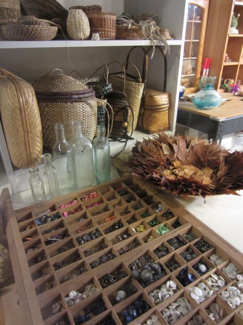
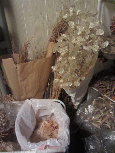
Here are some pictures (not very good, I’m afraid) of her studio and storage area.

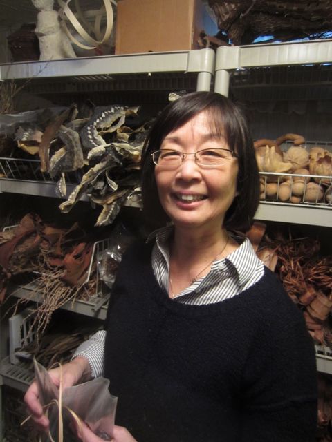
a terrible picture of Jan in her store room (bad lighting)


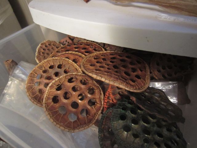
lotus tops with cedar bark looping

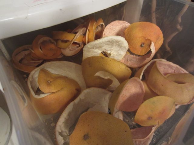
grapefruit peels, one of Jan's non-traditional materials


Thrashing About

I’m working on a new series for my solo show in March at Foster/White Gallery. The work is inspired by Madrone trees and is actually going well. It’s just that I’m both developing patterns and writing an artist statement (due tomorrow). Hence the aforementioned thrashing.

After a couple of days of writing I think I’m getting close to my statement. It seems that I have to spiral in to it. I start with some research and then begin writing.

My first draft reads like a middle school science report. So I write some more and then I edit,

and edit,

and edit,

and then edit some more until I finally get to the kernel of what I’m trying to say. My hubbie, who is an excellent writer, copy edits it for verb tenses, etc and then it’s done!

Having done this many times before there just don’t seem to be any short cut in this process for me.

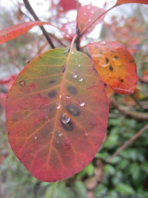
Above is a pretty picture of the Smoke Bush leaves from my garden and below are some sketches of the new work. They are a little hard to see in these photos but they are full size drawings of designs for three-dimensional works that will be on panels.

I’m going back to thrashing about.

An Ending

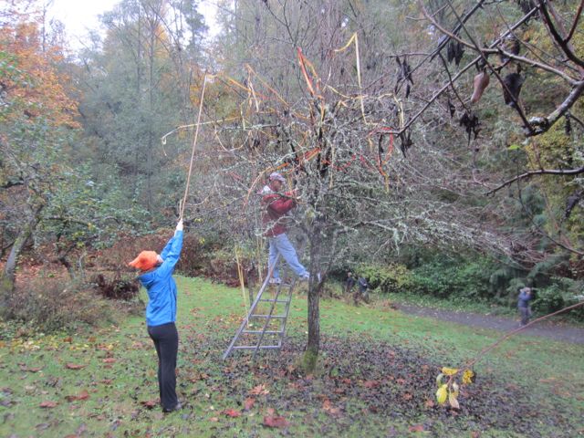
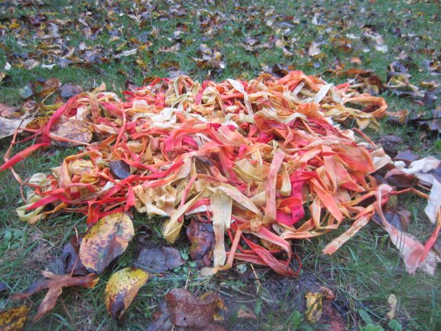
Today I took down the remains of The Orchard Room with help from my husband and daughter. It took the three of us 45 minutes to take down what had taken six people 8 hours to put up. But that’s the way it always goes with these things.

Endings are a time for reflection. The time is fitting, coming as the leaves are falling and compacting into a wet mulch around the bases of the orchard trees.

On my first visit to the orchard the trees were in bloom and white petals floated down to the damp grass. When we installed the grass was covered with drifts of tiny daisies and little hard fruits were beginning to grow. The fruits swelled with the seasons as the ribbons faded in the strong Summer sun. During the harvest season we talked of art and sang songs of love. In October we lit our lamps, shared hot cider and wended our way out of the orchard together, carrying our lights with us.

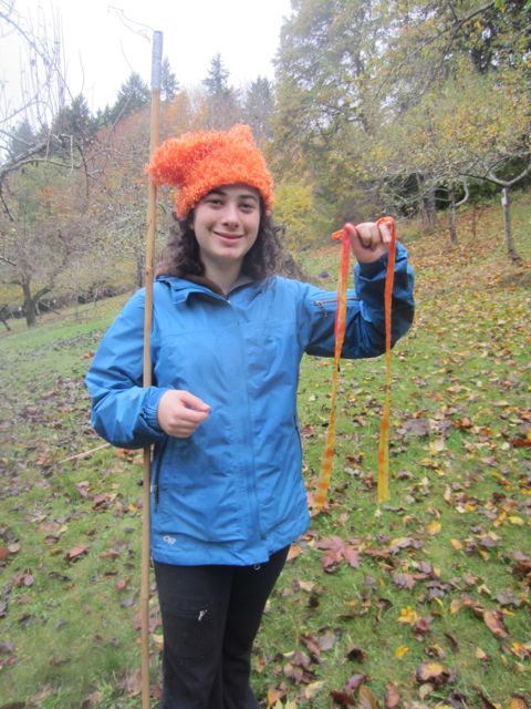
Vida with the last ribbon

This installation gave me a sense of rootedness in the seasons, with this specific patch of land between four trees, and with my family and community. My intention was to create a place for people to meet and share experiences. By defining a room with trees as walls and the sky as a roof, we placed ourselves in nature and in time.

There were some disappointments along the way, there always are, but it was deep for me. My hope is that it had meaning for others as well. It definitely created a time and place in memory for my family. My girls are growing up. They will be finding their own lives and paths away from us soon. They already are.

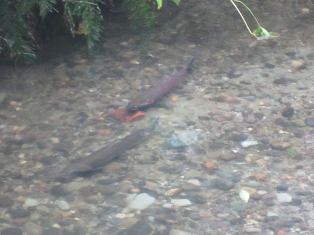
Today we saw the salmon fighting their way up the stream in their last effort to lay eggs for the next generation. They struggle so hard, battered by their journey, on their way to their deaths. People cheer as a big male makes it over an obstacle, commiserate as he slips down again to rest, and then to try again.

Rest and regeneration. Life and death. Flowers to fruit to fallen leaves. In the ending is the beginning. As we headed back to our car I found myself thinking about next year. Would I apply again to make art at Carkeek Park? Perhaps.

But first, the quiet of the Winter must come to the orchard, where the trees will sleep, dreaming of the sun’s return.

Fall Color In and Out of the Studio

The Fall color has been lovely this year. The rain intensifies the color. The brilliant yellowsĀ contrast against the dark wet bark of the trees.

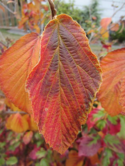
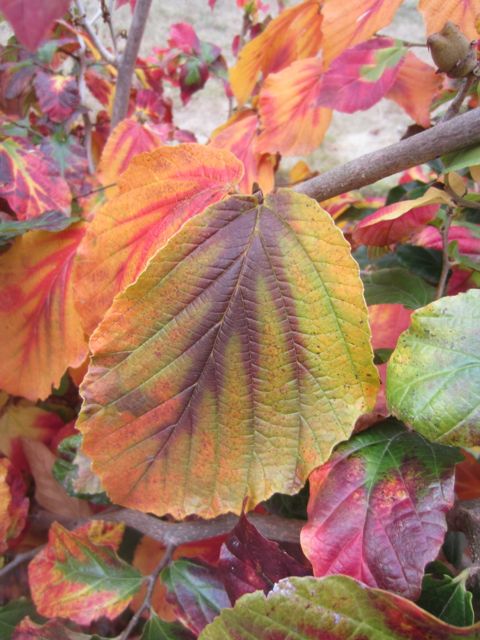
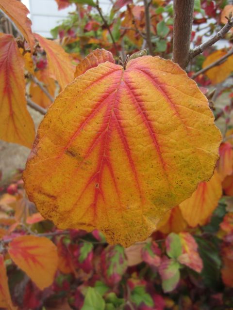
This shrub in my neighbor’s yard took my breath away. Even though I was running late I had to pull my camera out of my bag and document the rich oranges, yellows, reds, purples and greens of the leaves.

Those same colors have been warming up my studio on these rainy afternoons. And I can pull them out again in drab February and reminisce about Fall color.


New Colors/New Marks

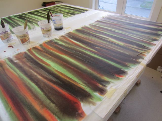
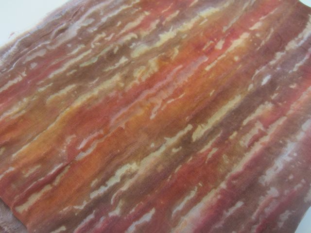
I’ve started on the new work for my show in March. I’m drawing, working on samples, and dyeing. The color way I’m using for the dyeing is based on the warms browns, oranges, and greens of Madrone trees. Today I painted with dye in an attempt to capture some of the essence of the marks in the book I made a few weeks ago. Tomorrow I’ll wash it out, see where I am, and dye some more.

Color Tests

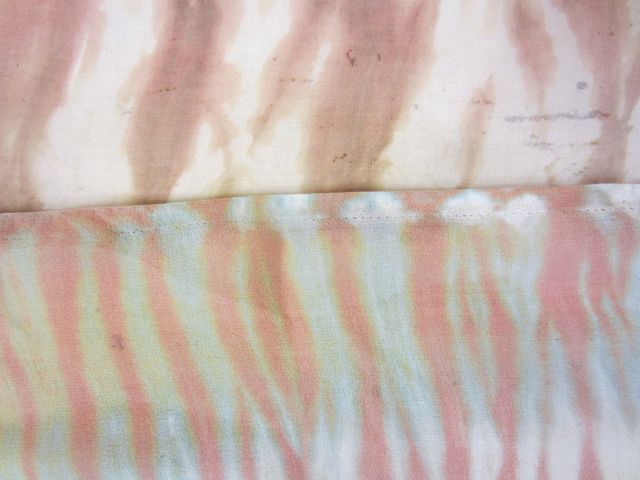
Chino on organza and silk chiffon

This week I’ve been filling in some missing pages in my dye book. Somehow, in all the colors I have used and tested over the years there are no blues! Not really surprising when I look back at my work. About the only time I use blue is when I’m teaching. My intern, Mia, has done a terrific job doing tests on small pieces of fabrics so that I can see the colors hidden in the jars of dry dye.

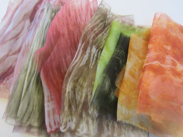
I’m spending a lot of time these days drawing and cogitating on my solo show coming up in March at Foster/White. I’m planning to do an installation with big panels of dyed organza. I thought I’d do some tests while the dyes were mixed and ready. I sewed the panels into sleeves that fit on to my pvc pipes then smooshed them down rather than wrapping each with cord. It’s a bit of cheat but you can still get really beautiful results. Since I’m looking at doing 50 yards, I need to do it in a way that’s achievable in the time frame.

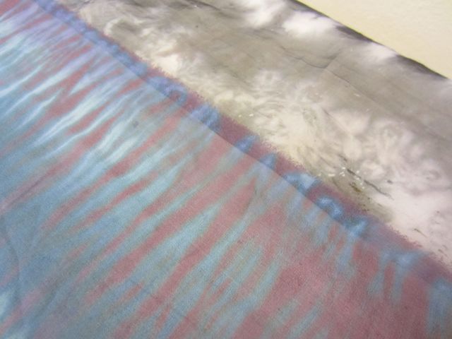
Wow! What an interesting set of results! I dyed both organza and a silk chiffon and got really different colors and effects. I used New Black 300 from Dharma, Chino from ProChem and Chocolate Brown from Dharma. Black and browns on silk are really hard to get using procion dyes and an alkaline fixative because of the way the dye chemistry works. Reds strike first and can dominate the color before the blues come along to shift it.

The chiffon compressed quite a bit and gave a tight and regular pattern and really dramatic color because of the way the dyes split. The marks on the organza were much more irregular and organic and I got a surprisingly good black. I wonder if this is because the seracin is still in the organza while it is stripped out of most silks. Always more research to do.

Although the color effects on the chiffon are very seductive, I’m still planning on using the organza. I like the transparency, the body, and the organic nature of the marks. I’ll have to file away that chiffon for another time and another project. I’m sure I can dream up something.

new black on chiffon and organza

Stitch on Paper

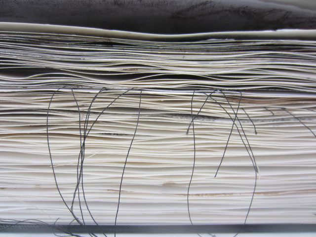
For the last few weeks I’ve been working on a book. I started it in my workshop with Larry Calkins and it’s what I focused on during my Orcas Island retreat. It’s a repository of marks. It’s a place to make without engaging my inner critic. It’s a place to play and experiment. I’ve been obsessed with it, working both at the studio and at home after everyone’s fed and the kitchen is cleaned up.

In the book I’ve experimented with a lot of different techniques but with a very limited palette: black, white, and brown. I used sumi and walnut inks, white acrylic paint, black and brown water-based printing ink, toner transfers, black and white thread, charcoal, graphite, and conte crayon. I painted, printed, drew, cut, tore, collaged, and stitched. I worked back and forth through the book, adding layers until each page felt complete.
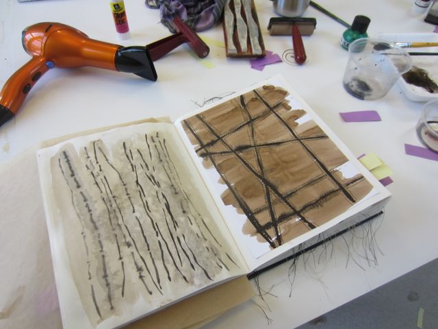
Over the years, my studio-mates and I have critiqued each others’ work both formally and informally. It’s been pretty informal for the last 18 months or so because of transitions in all of our lives. But now that the Fall is upon us we are back to planning and scheduling our sessions. I went first today with my book.

I was excited to show it to them. The book feels big to me, like a dictionary of my personal language of imagery. But I was also nervous. Would they flip through idly? Say, “hmm, that’s nice.” It is, after all, not a finished piece or something I would show in a gallery, but a record of being in the moment. It is an attempt to reset my brain and my hand after a long slog through production before I jump back into the process of making.
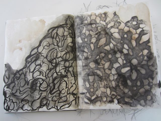
sumi and walnut inks, toner transfer
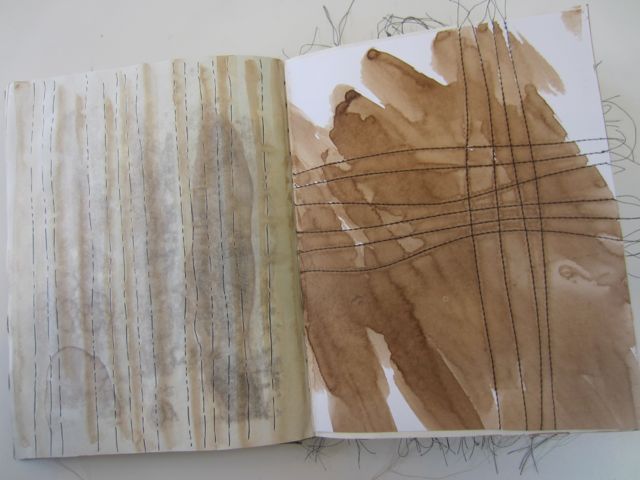
walnut ink, brush pen, stitched paper
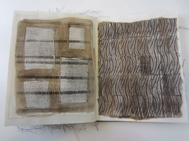
monoprint, walnut ink, stamped acrylic paint


I didn’t need to worry. Paul, Anna, and Pam pored over every page. They asked questions, oohed and aahed, got into my process. They really saw the book as the big step that I feel it is. They made suggestions of ways to build on what I’ve started. Ideas of developing some of my visual ideas into drawings or prints. Ideas that make me nervous because I don’t know how to do that yet. Ideas to push me out of my comfort zone. But isn’t that what I’ve been after?

So what have I learned about myself, my process, and my language of mark making? I’ve learned that, at least for now, stitch is integral to my work. By making the choices I did with my media, from stitching on paper to drawing lines of dots to transferring copies of my dyed fabrics, thread and stitch are what I’m drawn to over and over. Color, form, and texture are all important, but stitch is constant.

So where does this lead? What is next? How do I incorporate this into my existing work? I don’t know. I think I just have to start and it will seep in to the new work. It’s already there.
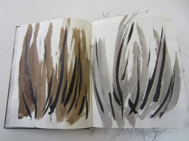
sumi and walnut inks
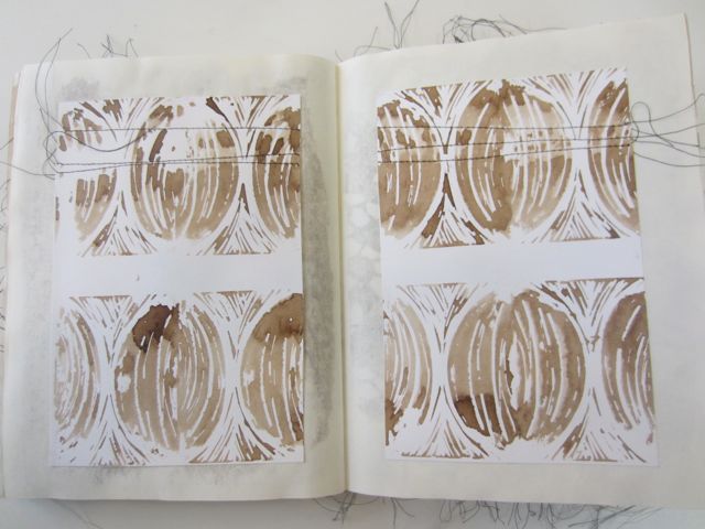
walnut ink stamped on to stitched paper
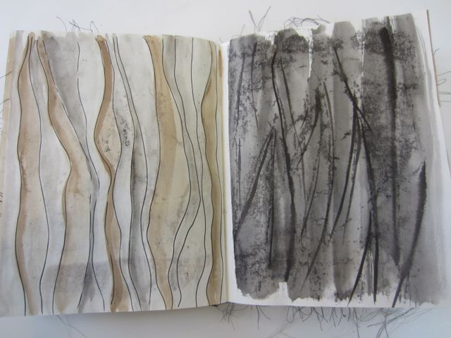
walnut and sumi inks, brush marker, toner transfer
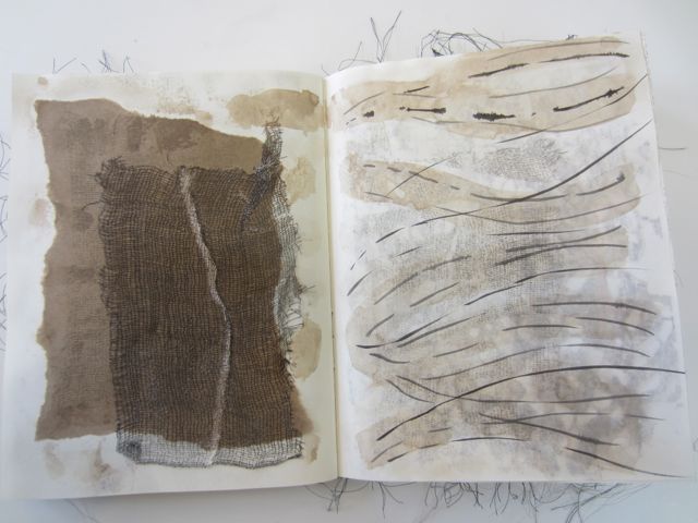
collage, printed cheesecloth, stamped and painted walnut and sumi ink
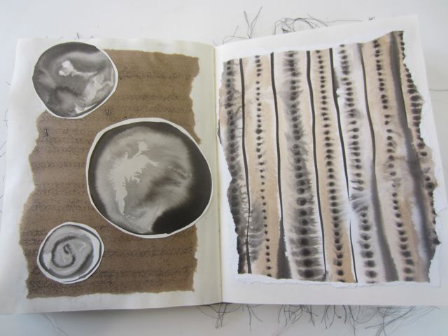
collage, monoprint, walnut and sumi ink
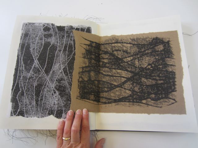
monoprint

monoprinting with stitched paper


Retreat to Orcas Island

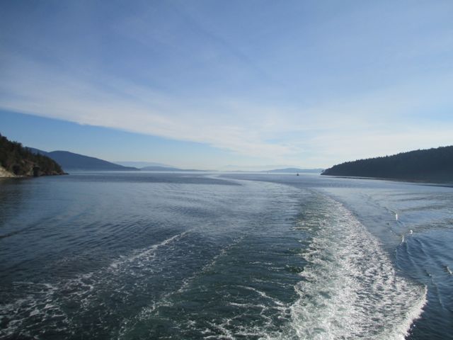
on the ferry to Orcas

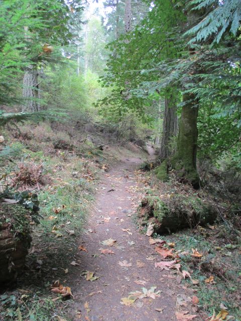
I spent three days alone on Orcas Island this last week at Doe Bay Resort. It’s a lovely spot that I’ve been to many times, but not since my kids were born. I rented a little cabin all to myself and filled it with food, music, and art supplies. I took hikes, drank tea, listened to music, and played at art. It was a retreat, a chance to get some head space after the busy summer, to make marks on paper without attachment, and to be reinvigorated by nature.

the trail at Obstruction Pass State Park

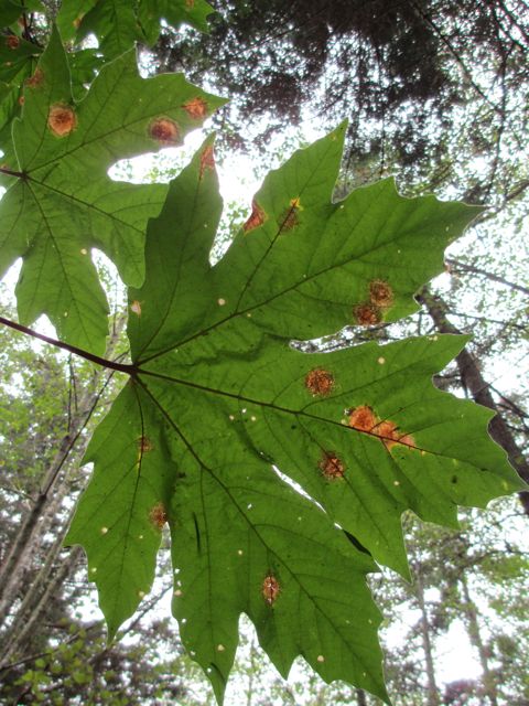
big leaf maple

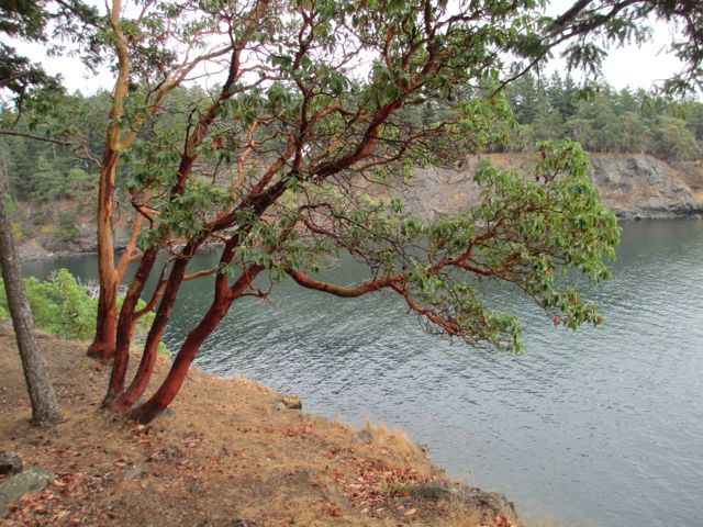
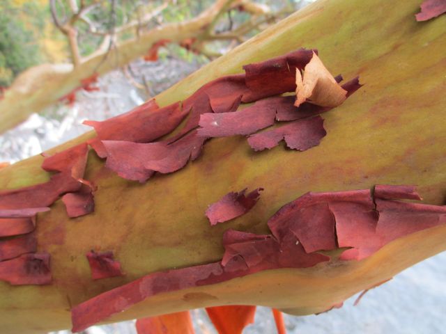
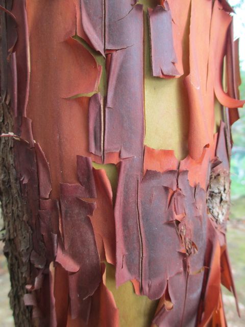
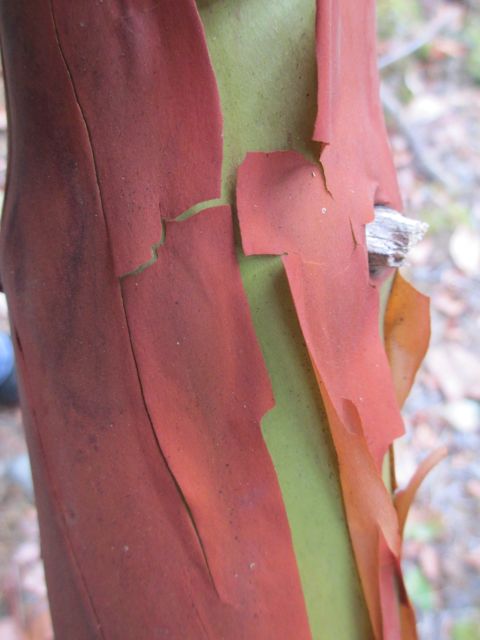
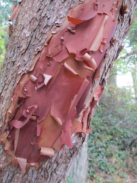
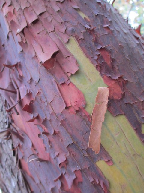
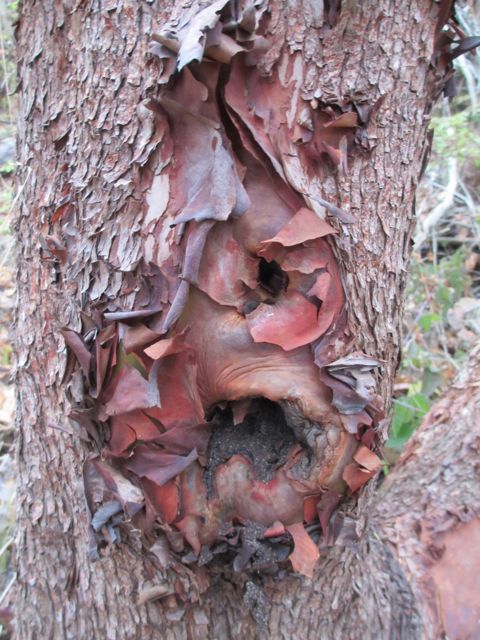
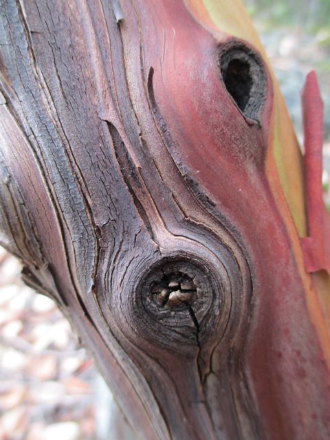
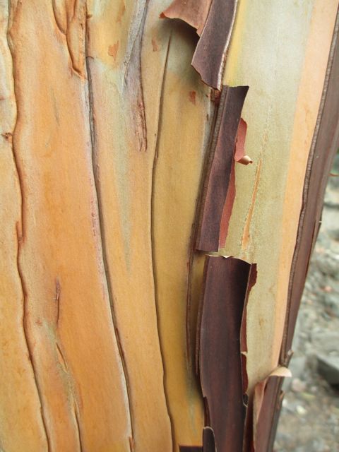
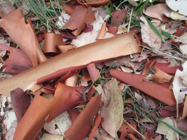
I was drawn to the San Juan Islands for their beauty and specifically for the madrone trees. I’ve been thinking about them asĀ  inspiration for my next body of work. Madrones, arbutus menziesii, are spectacular trees. Their rough outer orange bark peels away to reveal a muscular bright green inner bark. They grow on rocky cliffs and outcroppings overhanging the sound, twisted by storms. Their textile-like bark sheds and collects in piles at their bases. It was gratifying and satiating to just sit with them.

arbutus menziesii

On my last day on the island I went to a spot that a local told me about that’s not on the tourist maps. It’s a point of land that juts out into the sound and is sacred land to the Lummi Tribe. Like all the hikes I did in my three days, I was completely alone with nature. I followed the faint trail, breaking spider webs, through the brush until I found groves of madrones. It was a special place, quintessentially northwest. As I turned backĀ  to my car and the 12:10 Ferry, I stopped and thanked the spirits of the land. It felt right.