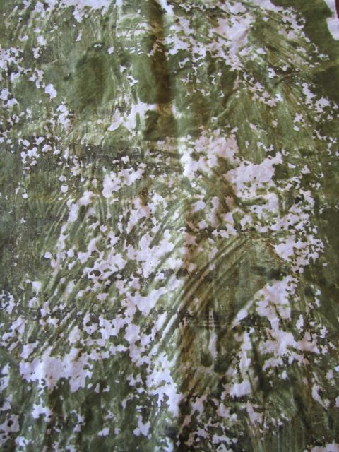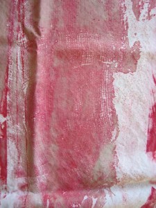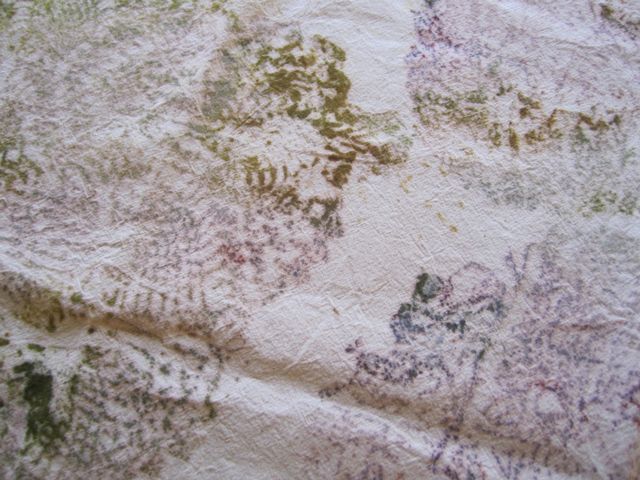
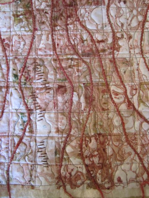
I borrowed Gwen Hedley’s new book, Drawn to Stitch, the other day from my friend Peggy. It’s really terrific and inspiring. The author’s focus is on hand-stitching but I think there’s a lot there for anyone who works with fiber and stitch. I was inspired by one of her exercises and spent a couple hours on the project. I took one of my pieces of breakdown printed fabric, tore it into strips, and then wove it loosely together on a piece of fusible web. Once I got it woven I fused it together to stabilize it, then layered it onto some dyed batting and background fabric. I machine stitched it along the grid, free-motioned it to emphasize the dyeing, couched some yarns down, and even did a few seed stitches by hand. I’m happy with it, although it is of a shape and size to remind me of a potholder. It reminds me of a map with the combination of the grid and the organic shapes. And it was enjoyable to do a project without a specific end point, kind of like a three-dimensional sketch made of stitch.
Author Archives: Cameron
Show at Foster/White
Talked to Phen at Foster/White Gallery this week and we scheduled a show in the gallery for April. Pretty exciting! It’s really good for me to have a target date, I work best to a deadline. It helps me to focus and make work plans.
Not All Fun and Games
I use some premixed dyes in my work. Finding the time in the studio to painstakingly mix and document mixing tertiary colors has been something I’ve wanted to do, but just hasn’t made it to the top of the list yet. So I order my colors from ProChem or Dharma Trading, test them pretty thoroughly, and keep a dye book of the results. I reference my book all the time.
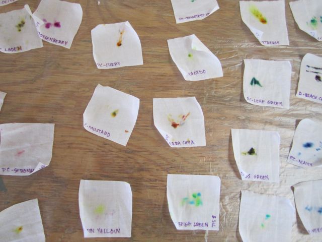
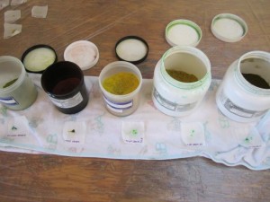
When I took Jane Dunnewold’s class this Summer, she suggested doing tests of mixed dyes so that you can see what primary colors are being used to create them. So I did “tap” tests of all my colors by labeling two inch squares of cotton, dampening them, and then carefully tapping just a tiny bit of dye onto them. The dye colors spread without mixing and you can see the make up pretty well.
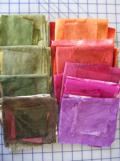
I got some new dye colors as well from ProChem and have started testing those. For my book I dye cotton, raw silk, habotai silk, and I’ve started doing rayon, too. Next I will test the different discharge agents. I use thiourea dioxide, bleach, and I just got a new product from ProChem called DeColourant that is supposed to be more environmentally friendly.
This stuff is enjoyable too, it’s just more the “work” of artwork.
Halloween Parade
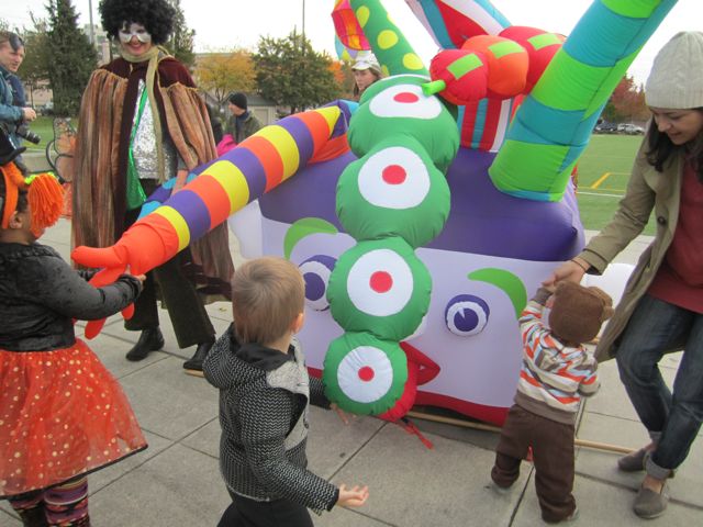
On Halloween I brought out Bad Hairy and some banners for the Capitol Hill kids’ Halloween parade, the Creepy Crawl Parade. It’s their first annual parade and they asked me to come and bring some festive elements to make a splash. It was great fun, they had a good turn out, and the weather was beautiful (always a concern around here). It was a lovely family event, lots of cute babies and other youngsters along with their parents. Bad Hairy was a big hit with the kids, it’s so interactive. They can shake one of his three hands, high five him, squeeze his nose, even poke him in the eye. And the inflatable is so easy, just take it out of storage and charge the batteries. I hope they ask me back next year!
Oatmeal! It’s What’s for Fabric
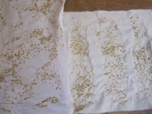
I’ve used flour paste as a resist for several years and love the effects. I’ve wondered about other starch based resists, just never got around to testing them. In this month’s Quilting Arts Magazine there is an article on using oatmeal on fabric and I couldn’t “resist” trying it. I was a little dubious when I cooked it up and smeared it on the fabric but I like the effect. Some areas are partially resisted by the oatmeal goo (why my husband hates the stuff) and some are completely resisted by the oats themselves. It’s a little hard to wash out. Soak the fabric first then throw the oats in the trash. If you put them down the sink they’ll clog your drain. Next up, trying it on some bigger pieces.
Positive/Negative
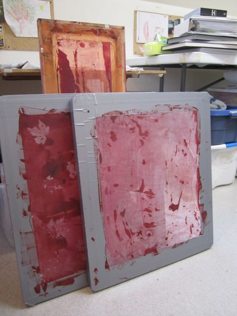
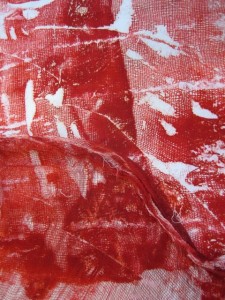
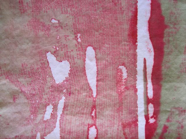
I’ve been working back and forth with imagery, using doilies and cheescloth to both print with (positive image) and as resists (negative). For example, I used cheesecloth to create breakdown printing screens. I first coated the blank screens with thickened dye in two reds. I layed the cheesecloth onto the screen and let it dry overnight. When I pulled the cheesecloth off the screen it was coated in dye. I soaked some cotton in soda soak solution then laid the dye soaked cheesecloth on top, rolled it up in the fabric, and batched it overnight. Voila! Dyed cheesecloth and dyed cheesecloth pattern on the fabric.
I then printed the breakdown screens. I added a little Moss dye to the print paste along with the fix mix to get a blended color in the prints. I knew I wanted to tone down the red after having seen the first set of dyeing. In these fabrics you see the print paste through the negative space where the cheesecloth dried on the screens. So again, I got three for the price of one: the dyed cheesecloth, the fabric “printed” with the positive image of the cheesecloth, and the breakdown printing using the cheesecloth as a resist.
Blades
I’ve been developing a new series called Blades. It’s grown out of what I started this Summer working with grass, both literally and metaphorically. The Grasses Series was an investigation started by printing with blades of grass on the silk screen. I was thinking about grass and how it is so common that we don’t see it except as a green expanse in a manicured lawn, or as weeds coming up where we don’t want them. The idea of “grass roots” as a powerful way to spread information becomes clear when trying to weed long underground shoots out of flower and vegetable beds. The resulting fabrics turned out very interesting but I didn’t end up using them as I had intended in the pieces I made this Summer. They were either too small, or just weren’t right for those pieces.
The pieces I completed this Summer, which will be in a group show called Olive Branch at Foster/White in their December, ended up being more about grains and are titled Emmer and Spelt. Only one piece said “grass” to me and I titled it Stipa, a latin name for a type of grass.
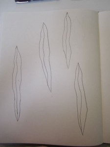
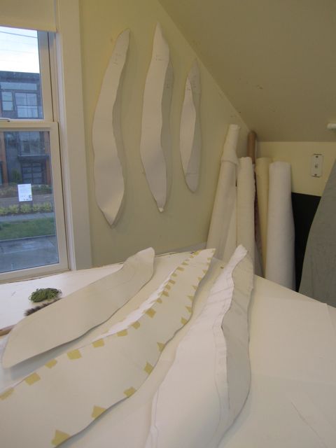
So I started working with the grass fabrics again this Fall, making some shapes that would work with them and the series morphed again. The grass shapes became Blades which have become a much deeper series than I originally intended. I currently have eight shapes made in paper and am planning on making four or five more. There’s another series brewing as well, the Cotyledons. I’m hoping to develop both of the series together. I’ve got three of the Cotyledons so far, hoping to do a good number of them along with the Blades.
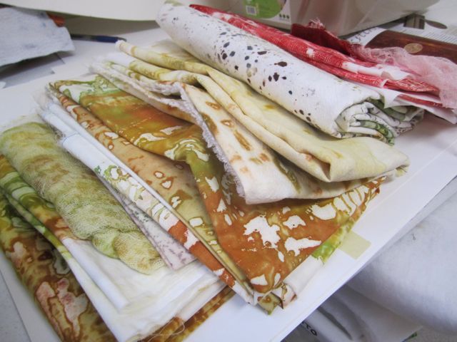
I’ve been dyeing as I go along with the paper work. Although the fabrics may not be specifically for these pieces, I’m sure there will be some overlap. I’ve been trying to stay focused on working in the paper but sometimes I just need to take a break and get some color on fabric. These wet and dark Fall days have been good studio days for me. It’s easier to spend time concentrating in the studio when it’s raining outside.
Doilies
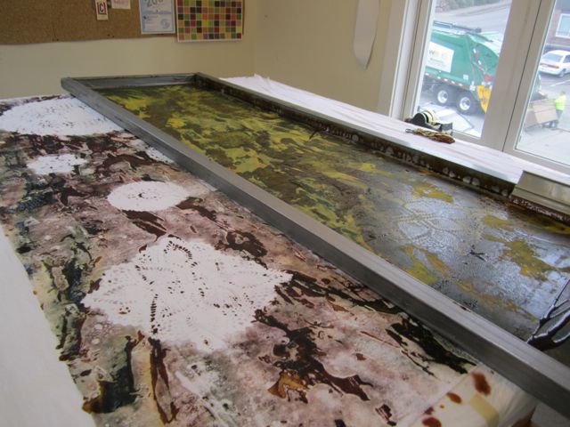
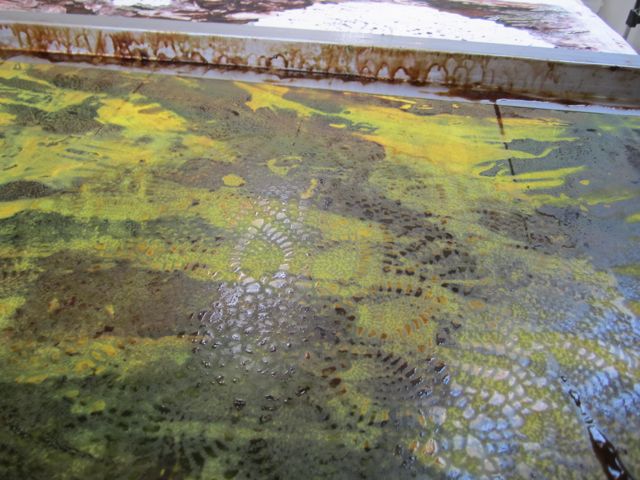
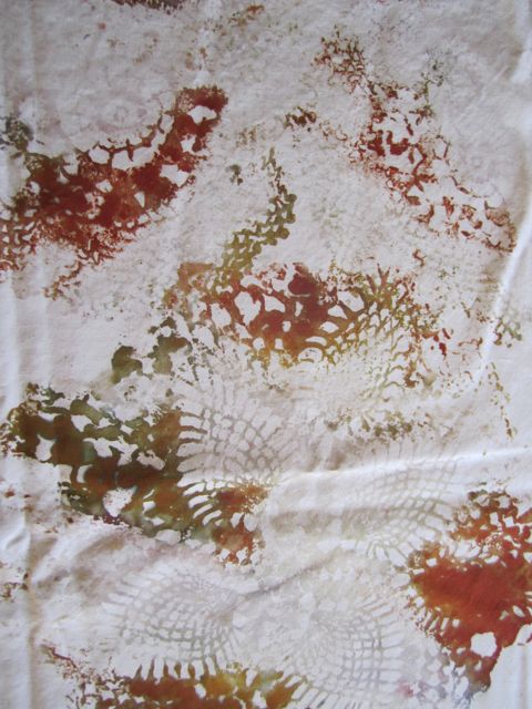
I’ve been working with doilies lately. I love the way they look and feel. I love the way they get dyed and overdyed when I work with them. I love that they are relics from another time when people made things by hand. You can almost feel the hands of the grandmothers and aunts who made them. Sometimes I feel a little guilty that I am “ruining” them by using them but they look so beautiful after they’ve been through the dyes and I know they would just be forgotten in some drawer if I wasn’t using them. This way I’m giving them another life. These photos show me using them as a resist while printing a big breakdown screen. In the photo below you can see the outline of the doily under the screen. After the screen was pulled I used the dyed doilies to print a piece of silk, then I rolled them up in some soda soaked fabric and let them sit overnight. Each gave a different effect, three for the price of one, plus I have the lovely doilies to reuse. A good new life I would say.
In the Garden
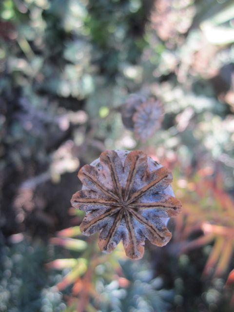
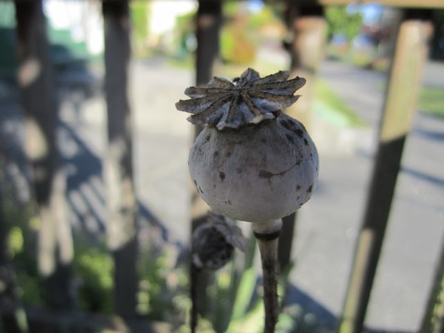
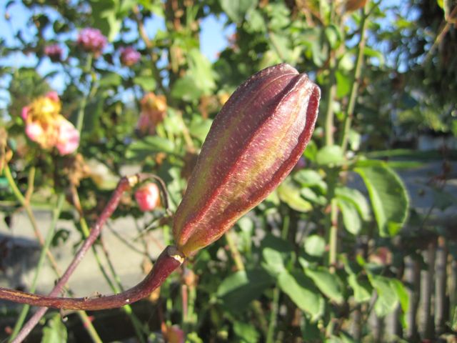
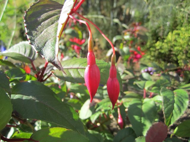
Took a little photo trip around my own garden. So many interesting shapes in the Fall. Here are the seed heads of poppies and lilies and the shapes of the unopened fuchsias.
Fall Color
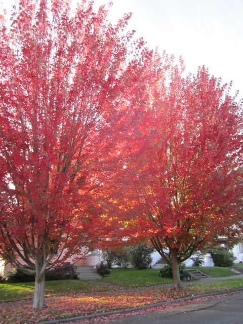
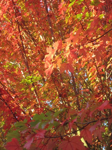
I’m lucky enough to see these beautiful trees outside my dining room window. When we moved into the house 12 years ago they had just been planted by our neighbor. Now they are about 30 feet tall and absolutely gorgeous year round. Yesterday the sun was shining through the leaves and I rushed out in my slippers to take these photos. The variety of color knocked me out! My mind is already thinking dye colors, let’s see, Bright Green 711, Avocado, Burnt Orange, Scarlet . . .