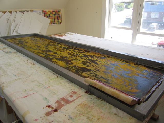
I just got back from a week-long workshop with Jane Dunnewold at the Pacific Northwest Art School in Coupeville, Washington. Jane, whether she knows it or not, has been my mentor since I discovered her first book in 2001, Complex Cloth. She is an innovator in the field of surface design and is ever researching new techniques and continually updating her methods as materials change and improve. I have all of her books including her newest, Art Cloth, and refer to them often. Suffice it to say, I’m a big fan.
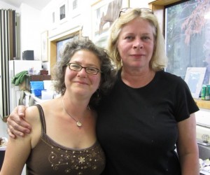 I took a workshop about four years ago from Jane on printing with thickened dye. I learned a lot and applied it immediately to my work and my teaching, where it has become a big part of my practice. This workshop though, on layering techniques with dyes and paint, didn’t seem like it would have as much new material for me. I decided to go for it anyway because I’ve been wanting to take a class for a while now to have time to get away and work with different focus. I also knew from my previous workshop with Jane that there would be plenty of lessons beyond technique. Jane’s critical eye for composition, her way of relating material to students through relationships, her depth and breadth of knowledge, and her warmth and humor are all part of the workshop experience.
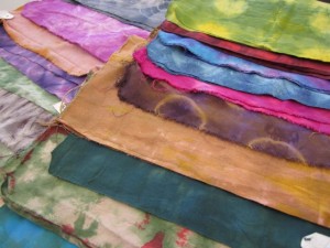
Swatches after two dye baths
The concept of this class was to create art cloth through creating multiple layers of dye and paint. We worked on small, swatch-sized pieces of fabric to be able to try many combinations. We manipulated fabric and dyed as many as three layers on a single piece of cloth. We created tools including stamps and stencils. We worked with various temporary resists on fabric and on silk screens. We worked with paint on the dyed fabrics using the tools and resists. Students made beautiful, complex pieces (and I made a few complete dogs which you will not see here.)
Jane has replaced the use of discharge in her personal work because of health and safety concerns. She uses paints to mimic what she used to do with discharge. She did demonstrate using chlorine bleach as a discharge agent, stressing safety and telling several cautionary tales, because she said she’d rather people learned to use it safely than try it on their own without guidance. I’m not ready to give up discharge, but I took her stories seriously. Although I use safe practices in my work, it was good to reinforce the respect that should be given to the dangers that can lurk in misusing these chemicals.
It was important to keep up our strength during class.
A few times during the class I found myself thinking, “Well, that’s not the way I do it!” I had to laugh at myself and tell myself that I wasn’t there to do things my way, but to try something new. If I wanted to do it my way, I could stay home and work! The class was a great opportunity to try new things, to get out of my head, and to do some open ended exploration.
Along with the techniques, the big focuses of the class were on color theory and composition. Jane stresses creating a “color constant” for yourself matching the media you use to the color wheel. You can then teach yourself how to mix color using the pure color dyes and paints so that you are in control, rather than using the proprietary mixed colors sold by the dye and paint companies. I have to admit I love my mixed dyes. I test them fully and find them a great short cut for working with tertiary colors, but I understood her point. I’d like to spend some time in the studio this Fall working with blending tertiaries from pure colors. It’s something I’ve been wanting to do for a while.
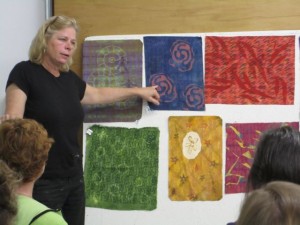 For me, the most valuable part of the class was the time spent in critique sessions, analyzing color and design choices. Jane is amazing to watch in action, stressing that there are many answers to each question. It is up to the individual to identify the options, and then pick one based on objective rather than subjective analysis. In critique we can apply the same choices, analyzing objectively rather than responding to our “likes” or “dislikes.” Jane spent a morning identifying language and concepts to analyze these choices. It’s discussed in her new book and is definitely worth reading.
I was really pleased with the workshop. I came away with some nice samples, some new tool ideas, and some deep thinking to do about color. It was a great group of women and I enjoyed meeting new people and had a great time hanging out with my roomies. I definitely drank a lot of wine! But like any workshop, it will take many months to assimilate what I learned into my own work. That’s part of why I don’t take many classes. As much as I love Jane Dunnewold and her work, it’s not my work.
The rest of this long, long blog post is photos and descriptions of some of the swatches I did in the workshop. I documented each layer so that I could go back and trace what I did.
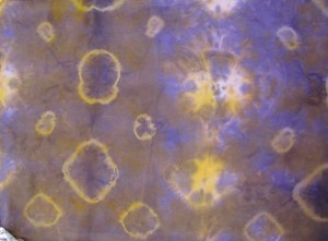
golden yellow with purple overdye
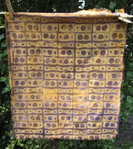
paint in complementary color stamped in overall pattern
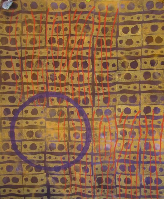
Here are three swatches I did in the class, explained layer by layer.
On Monday I started by loosely gathering a piece of rayon and dyeing it with golden yellow.
Tuesday, I used rubber bands to make circles on it and overdyed it with a purple made with Mixing Red and Mixing Blue.
On Wednesday I created an all over pattern by stamping over the entire piece with a complementary color.
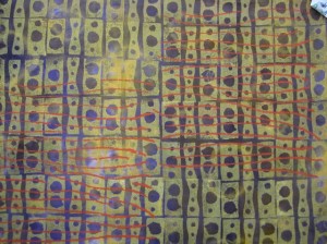
paint applied through flour resist screen
On Thursday I used a silk screen I had created by scratching a pattern through flour resist on the screen to print orange stripes across the grid made by the registered stamps.
And on Friday I added a large scale element to add a focal point using the purple of the background.
large scale image added in background color
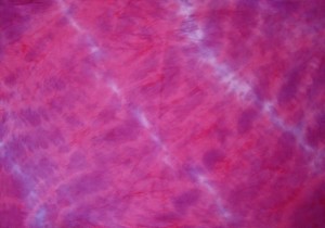
dyed mixing red and boysenberry
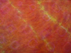
overdyed with rust
I started this second swatch by twisting the fabric and then dyeing it in the Mixing Red.
Tuesday, I twisted it again and overdyed it in Boysenberry, a red violet pure color I haven’t used before.
I thought that was pretty bright and not my color scheme so I put rubber band circles on it and overdyed it a third time in rust, a color mixed with Boysenberry and Golden Yellow.
On Thursday morning I covered it with a flour paste resist. Once that dried I crackeled it and painted over it with thinned black acrylic paint. I’m pretty happy with it now.
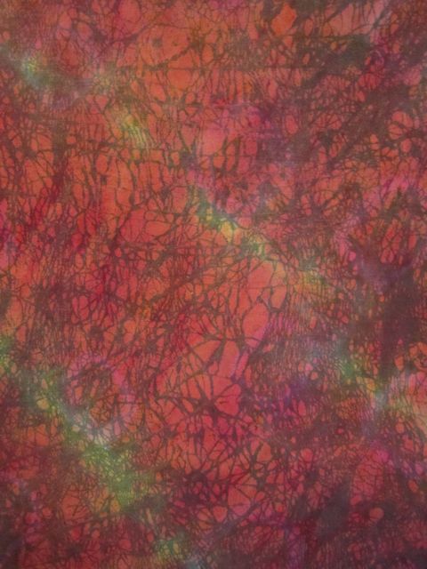
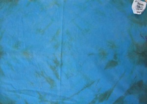 For the third sample I started on Monday with a piece of mercerized cotton broadcloth which I loosely pleated and dyed turquoise.
I didn’t get much texture from the manipulation so on Tuesday I folded it diagonally and overdyed it Rust.
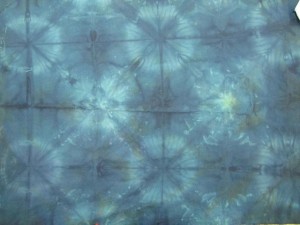 That wasn’t very interesting either so on Wednesday I flag folded it and put rubber bands around the corners, then overdyed it with Mixing Blue.
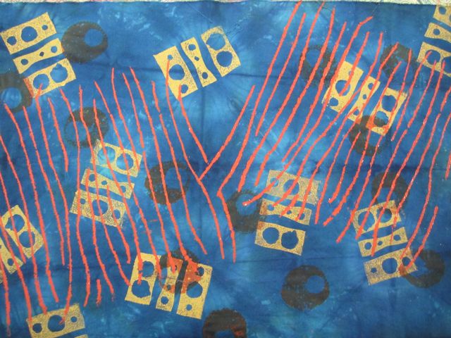
Well, that was getting somewhere! I then used an chrystallographic design of scattered elements and printed with complements using stamps in a bright value of the complement, stencils in a darker value, and finished it by printing my flour paste silk screen in a medium value. You can’t go wrong with orange stripes!
 I’ve been in transition lately. Where in the past the crispness in the air of Fall has been invigorating, this year it feels a little mournful. The busy Summer has moved into the new schedule of the school year. My oldest daughter started high school this Fall and both girls are starting earlier in the morning, which is challenging for the whole family.
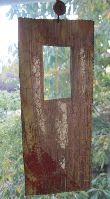 But about those doors and windows. I feel like I’m in transition in my art. I don’t know what the next thing is and it’s an uncomfortable place to be. There’s something different looming ahead but I can’t quite make it out. That feeling of being unsettled in my work bleeds into the rest of my life, I’m a little cranky, a little at loose ends. I’ve been through this before and it helps that I know it will resolve, but it’s still no fun to be here now.


 I took a workshop about four years ago from Jane on printing with thickened dye. I learned a lot and applied it immediately to my work and my teaching, where it has become a big part of my practice. This workshop though, on layering techniques with dyes and paint, didn’t seem like it would have as much new material for me. I decided to go for it anyway because I’ve been wanting to take a class for a while now to have time to get away and work with different focus. I also knew from my previous workshop with Jane that there would be plenty of lessons beyond technique. Jane’s critical eye for composition, her way of relating material to students through relationships, her depth and breadth of knowledge, and her warmth and humor are all part of the workshop experience.

 For me, the most valuable part of the class was the time spent in critique sessions, analyzing color and design choices. Jane is amazing to watch in action, stressing that there are many answers to each question. It is up to the individual to identify the options, and then pick one based on objective rather than subjective analysis. In critique we can apply the same choices, analyzing objectively rather than responding to our “likes” or “dislikes.” Jane spent a morning identifying language and concepts to analyze these choices. It’s discussed in her new book and is definitely worth reading.


 For the third sample I started on Monday with a piece of mercerized cotton broadcloth which I loosely pleated and dyed turquoise.
 That wasn’t very interesting either so on Wednesday I flag folded it and put rubber bands around the corners, then overdyed it with Mixing Blue.
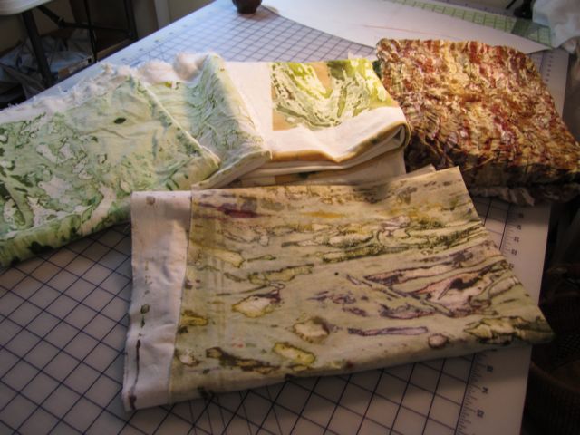
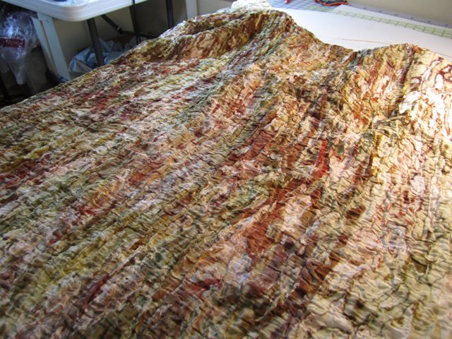
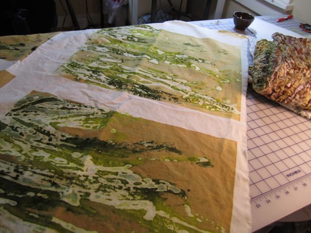
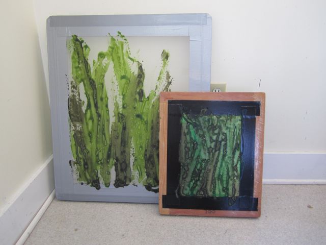
 I’ve been working on a new series based on grasses. On my early Summer walks I would see the long, graceful grass blades topped with heavy seed heads. So many different species escaping the mower in parking strips and at the edge of vacant lots, so much variety in individuals blades usually seen merely as “grass”.
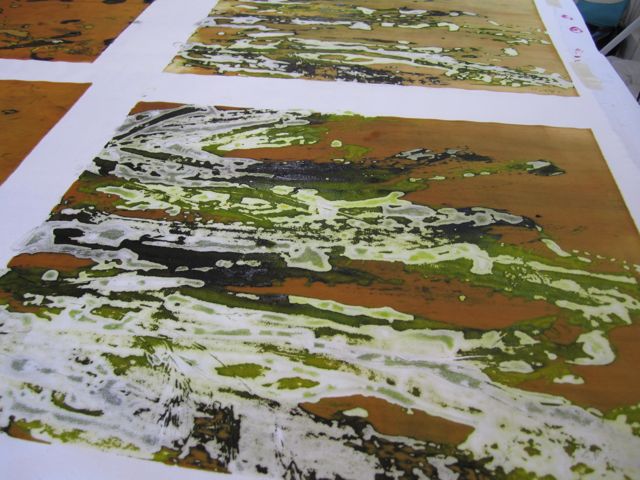 To start the series, I used grass blades as design elements in a few breakdown printing screens. The imagery is subtle in the printed fabrics, but is there if you look carefully. More, you get the feeling of movement. I also printed a large screen I had prepared last Fall using the broader leaves of irises. It was a bit of a challenge printing such a large screen by myself. Luckily the process is forgiving and I’m not trying to do anything with tight registration!