Category Archives: Work in Progress

Starting Small

IMG_2018

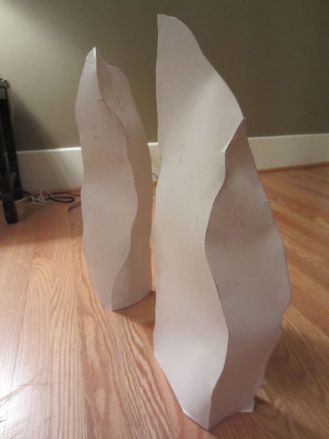
A couple weeks ago I stopped into Foster/White Gallery to pick up a piece of art that I was shipping to Wayne Art Center for Craftforms 2011. The pieces for the Stone Series are going to be in their January group show and while I was there Jessica asked me if I could make some big free-standing pieces for the show.

“How big?” I asked.

“Oh, about this big,” she said holding her hand about 4 feet off the ground.

“Hmmm . . .” I replied.

I’ve been thinking about working bigger for about a year but have been limited by my materials. The peltex I use just won’t hold up to gravity at that size without being held up by something else, like, say, the wall. I’ve been thinking about taking a welding class to learn how to make steel frameworks for pieces. But getting a piece or two done for January does not include learning how to weld.

So, I called my friend Steve Anderson. Steve is a great guy, one of those gentle giants who can turn hard steel into graceful shapes. We met and I brought him two maquettes, each about 18 inches tall.

“This one will be four and a half feet tall and that one will be six feet tall. Can you do that? How much? How long will it take you?”

Once I heard details from Steve it was back to the gallery to find out if they think they can sell the pieces if we raise my prices to cover the welding. So far, so good.

It’s exciting to be embarking on this new journey of discovery. And with a short deadline during the holidays, of course, just to make it extra exciting. But it keeps me going back to the studio. It’s good to shake things up now and then.
A New Toy

IMG_1828

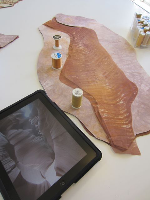
I’ve recently inherited an ipad first edition from my husband. He, of course, got the ipad 2. I don’t care what edition it is, I’m loving it! Beside the fact that it’s a pleasure to look at and use, it’s been really helpful to have in the studio. I loaded my photos from our Southwest trip and I’ve been using it while I work. We have wifi at the studio so I also have internet accessibility. I don’t normally carry around a laptop so I’ve really been enjoying it. And no, I’m not sponsored by Apple.

The Next Step

IMG_1807

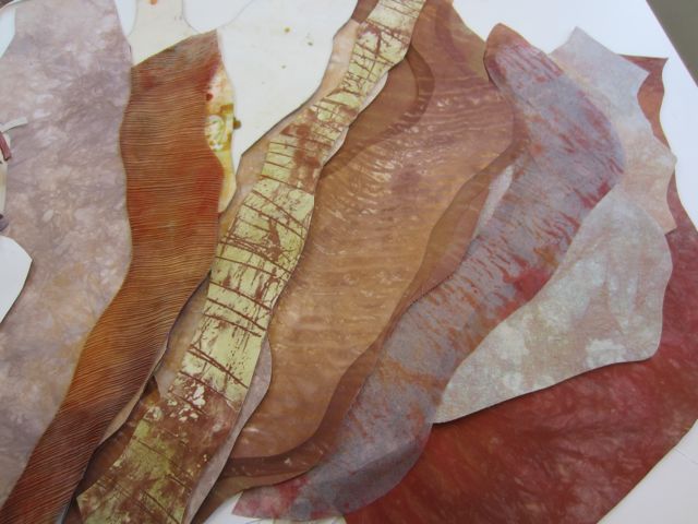
Here are the panels for the new series, as yet unnamed, all glued up and ready to go. Below is part of the audition process. This series is responding to my trip last Spring to the Southwest.

I’ve really got to do some writing and thinking about these forms to get to their meaning. I can feel it but I haven’t found the words yet. First things first, I’ve got to get them done and to the photographer by Friday and it’s going to be a stretch.

IMG_1802

SDA Seattle

IMG_1775

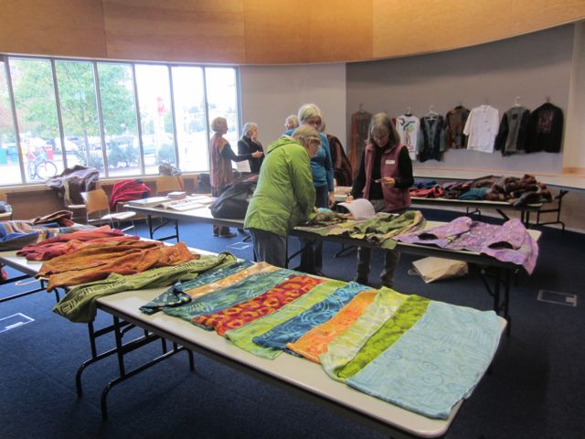
SDA Seattle is a group of members of the Surface Design Association who live in the Seattle area. We’ve been getting together monthly for about a year and a half. Overall there are probably 15 or so of us that come regularly and we discuss topics ranging from “what inspires you” to felting. This past month’s meeting was on Wearables. It was a lively meeting and we rediscovered what we need to make our meetings successful; we need to look and touch stuff! We’re all working with fiber and textiles and the sensuality of those media are what draws us. With that in mind, I think we’ll be focusing more on experiential meetings rather than “talky” meetings.

Shades of Gray

IMG_1767

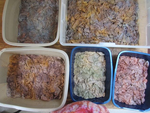
dyeing in a muted palette

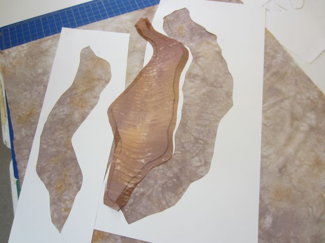
For this next series, which for now I’m just calling “Boulders”, I’m working with a much more muted palette. The idea is to emphasize the form and stitching rather than the surface design.

Oooh, this is so hard for me! I love color and texture. It’s like a drug for me. I’m just so in love with it that I think stepping away from it for a little while is a good idea.

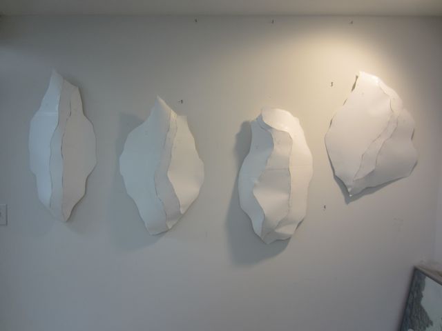
the "boulder" forms

the "boulder" forms

I’ve worked with lighter colors all Fall but really, I’ve only gone as far as mid-tones. So I took another step away from value in this dye session and lightened up my colors even more. There are several challenges in working with really light tones. One is that you can end up with pastels that look a little too much like a trip to the candy store. The other is keeping visual interest while muting the color.

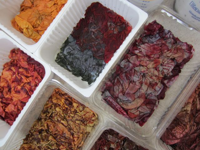
I’ve also been turning my process on its head a bit with this body of work. Usually I dye a whole lot of fabric and then play mix and match with the fabrics and the forms. This time I’ve designed the forms first and then picked out focus fabrics in midtones from the fabrics I dyed this Fall.  Then I used those focus fabrics as a starting point to dye light fabrics for the rest of the panels on the forms. I think it’s good. I think it’s going to work.

Once I ironed out these grays I was really surprised and happy at how much I like them. There are a few disappointments and a few gems, as usual in a batch, and at least one has a little more color than I planned, but there are definitely usable and I’m looking forward to working with them.

IMG_1770

Through Lines

IMG_2982

I feel like I’m finally getting somewhere with new work. I’ve been struggling away since the kids went back to school mostly because I’ve had too many ideas. But now I’ve got a deadline coming up at the end of October (I’m planning on entering Fiber Philadelphia 2012) and so it’s time to focus one idea and let the others percolate for now.

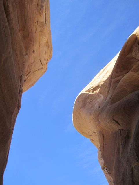
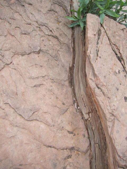
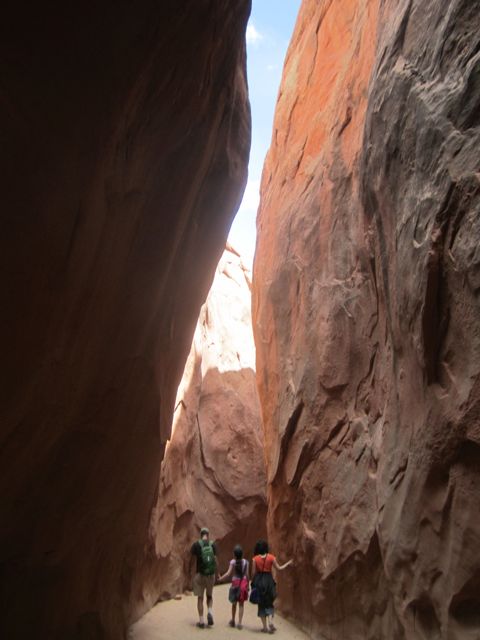
I spent a lot of time looking at my photos from our trip to the Southwest last Spring. While I was there I was drawn to images of cracks and splits in the Earth. I have many photos of these. Some are views of the sky from a slot canyon, some are fissures where boulders cracked and split, and some are of the trail curving away and disappearing around a bend. My favorite is a photo of a boulder split by a tree root. I imagine a small rootlet finding purchase in the stone and, over eons, growing until it splits the stone asunder.

IMG_2847

So I’m working with the image of forms that are split. Whether they are boulders split by a root, a canyon, a shift in geography, or a path curving around the bend will be up to the viewer.

IMG_3073

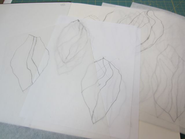
It took me a while to draw something that felt different, yet still related, to the work I’ve been doing with my recent series, the Seedpods, Blades and Cotyledons. My process is also a little different with this body of work. I spent more time sketching at a small size requiring much less time reworking at full size. The paper patterns have come together quickly because of this prep work.

I’m also starting with the patterns before I move to fabric. I have some new fabrics that I dyed (see the last few blog posts) but I’m going to try to keep the value light in these pieces. My plan is to emphasize the form and the stitching with these pieces and not get seduced by the color and texture of the cloth. Make a body of work where the pieces relate to each other but don’t compete. Simplify.

Yeah, we’ll see how that goes!

IMG_1719

Overdyeing Mania

IMG_1640

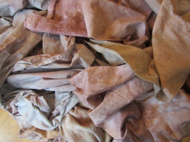
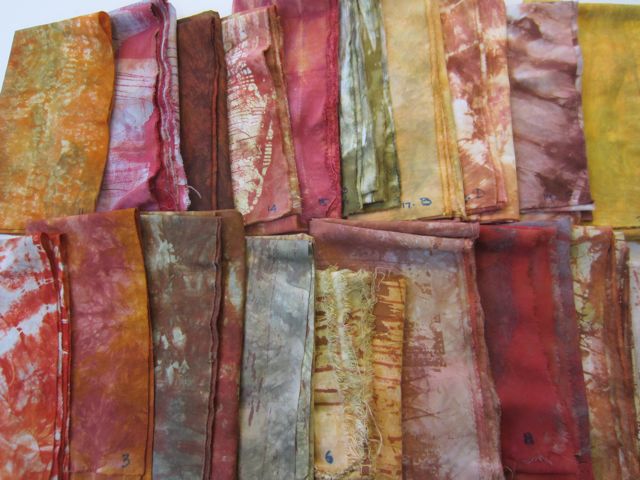
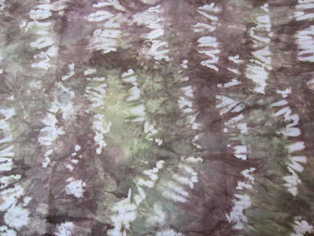
I overdyed 20 pieces of fabric the other day. In most cases I was just trying to knock back the white areas so there wasn’t too much contrast. In some cases I was toning back the color by adding a complement. It was a big dye day though and I was pretty happy with the overall results. Can you say earth tones?

IMG_1667

A Place to Start

IMG_1635

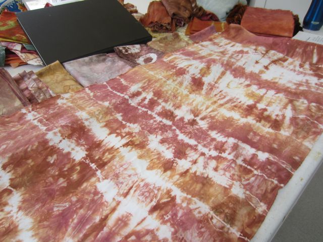
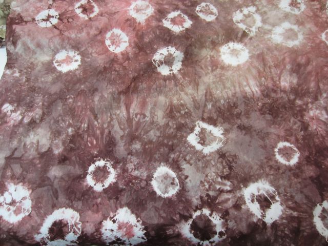
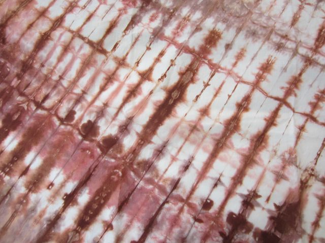
I’m in that pondering place, what’s next? As I flail about trying to figure out that million dollar question, I’ve been dyeing some fabric. I’ve been spending a lot of time looking at my photos from my trip to the Southwest and trying to recreate the colors and textures I saw there. Below are some samples. Now, what do I do with them?

IMG_1623IMG_1625IMG_1631

Testing 1, 2, 3, 4, 5

IMG_1558

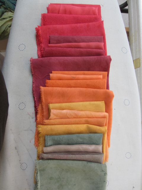
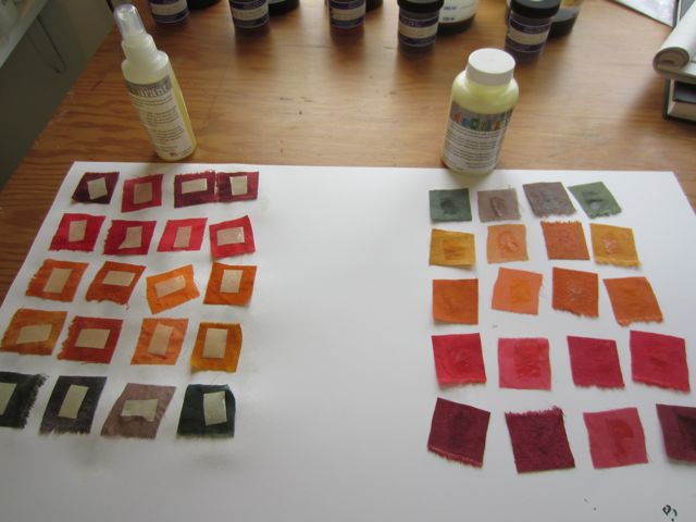
I finally tested five new dye colors I got from ProChem this Summer: Turkey Red, Barn Red, Pumpkin Spice, Butterscotch, and Sage. I dyed cotton, rayon, silk habotai and raw silk samples. Then I tested different discharge agents on each color sample. I used bleach in various formulas, thiourea dioxide, and Decolourant, a commercial discharge that comes as both a paste and a spray.

testing Decolourant spray and paste

testing Decolourant spray and paste

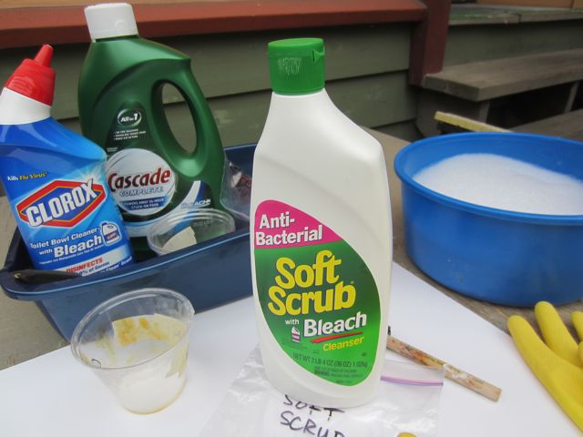
I used bleach on the cotton and rayon as a diluted spray, in Soft Scrub cleanser, in Clorox Toilet Bowl Cleaner, and in Cascade dishwasher gel. I skipped all these on the silks because the chlorine in bleach is too strong for them and will break down the fibers.

Soft Scrub is a good dependable discharge agent. It bleaches really well and is already thickened so can be used for stamping, stenciling, silk screening, etc right out of the bottle. Don’t use it on any silk screens with photo emulsion, though, the bleach will eat away your designs.

testing househould cleaners as discharge agents

testing househould cleaners as discharge agents

The dishwasher detergent didn’t work for me at all. It said on the package that it had bleach but I couldn’t see any results. My friend Deborah Gregory has used it and gotten good results in the past. We wondered if they had changed the formula since it’s been several years since she used it.

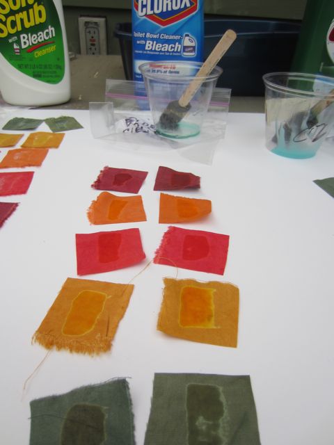
My new favorite is the toilet bowl cleaner. It isn’t thick enough to hold an edge for stamping, etc but it gives a really interesting halo around the discharged area. It seems that the edges of the liquid discharge faster than the wetter center area. You have to wash it out before the full bleach process has occurred or you lose the effect. So keep an eye on it and a bucket of soapy water close by stop the reaction when you’re ready.

you can see the haloing around the discharged area

you can see the haloing around the discharged area

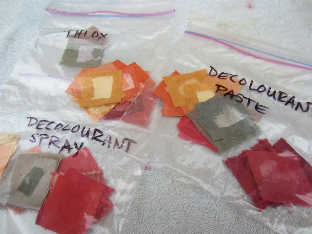
The thiox and Decolourant products had very similar effects as far as color. Interestingly the Decolourant discharged the most color on the rayon.

So what do I do with all these samples? I paste them into my dye book. It’s my studio bible, where I go to figure out what colors I want to work with and how they will react to discharge. It’s an invaluable and evolving resource. I’ve begun the slow process of reorganizing it and am hoping to have an intern this Fall to get it further into shape. Not glamorous work, but important.

samples ready to be pasted into my book

samples ready to be pasted into my book

A Good Read

IMG_1538

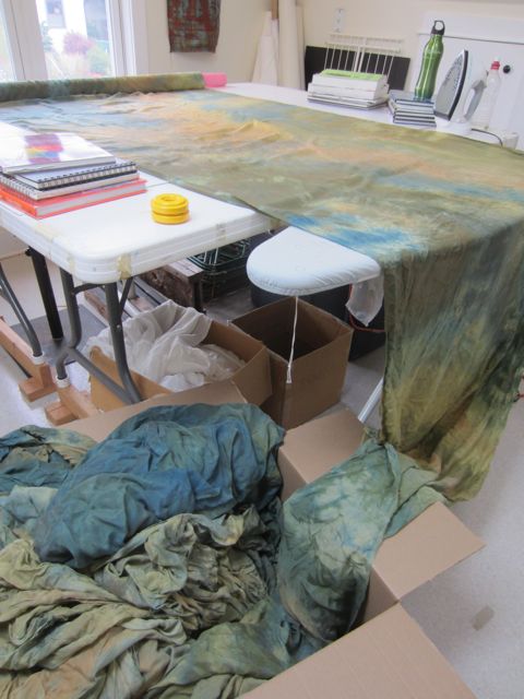
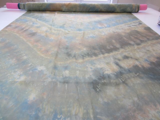
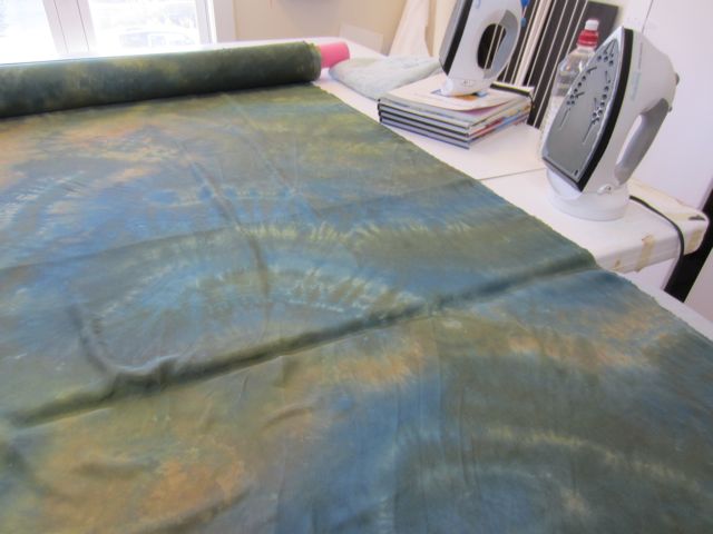
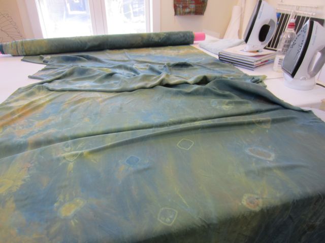
Reentering my studio practice post-Summer fun required some tidying up and putting away. Today I finally put away the puppets and lanterns from Country Fair that had been waiting since July to be stashed away in the back corners of my storage. I also finished ironing and rolling the long piece of silk that I brought to Burning Man.

I washed the silk before putting it away since it was exposed to the alkaline dust of the playa and also smoke from the fire. I figure the ironing took between 6 and 8 hours to iron all 150 feet of it! Quite the meditation. I split it up, doing a little bit each time I was in the studio. Today I was ready for it to be done so that I could open up the space and move forward into new work.

But because I haven’t been in a big hurry to get it done I’ve been able to appreciate the fabric as I went along. I often feel when I work with my fabrics that I’m reading them like maps. Because this piece of fabric is so long and because I did the ironing over days, it felt more like reading a novel. The colors were the characters and the marks were plot developments. Like many a novel, it had parts that were better than others and it did sort of bog down in the middle. But overall, although it’s not for everyone, I can recommend it.

the plot thickens . . .

the plot thickens . . .

IMG_1609IMG_1612

a happy ending

a happy ending